
Datawrapper vs Flourish: Which Data Visualization Tool Wins?
Overview
Datawrapper and Flourish are two popular data visualization platforms that help users create charts, maps, and interactive visual content. Datawrapper is known for its simplicity, clean design, and focus on editorial data visualization, making it a favorite among journalists and media organizations. Flourish, on the other hand, offers a broader range of templates and interactivity, making it a powerful tool for storytelling, reports, and presentations. While both are excellent choices, they cater to slightly different user needs and skill levels.
Key Features Comparison
- Datawrapper: Intuitive drag-and-drop interface, responsive and accessible charts, quick export to PNG/SVG/PDF, built-in annotation tools, and a focus on static and embedded charts for news articles.
- Flourish: Rich library of interactive templates (bar charts, line graphs, maps, scatter plots, etc.), support for animated and story-driven visualizations, easy data connection via CSV or API, and collaboration features for teams.
Datawrapper excels at producing clean, publication-ready static charts with minimal effort, while Flourish shines when you need interactive, dynamic visualizations that engage audiences.
Pros & Cons
Datawrapper
- Pros: Intuitive interface, no coding required, excellent for quick and simple charts, free tier available.
- Cons: Limited chart types compared to Flourish, less customizable, no interactive features like animations or drill-downs.
Flourish
- Pros: Wide variety of chart types including interactive and animated, highly customizable, great for storytelling and presentations.
- Cons: Steeper learning curve, free tier has watermark, some advanced features require paid plans.
Datawrapper
- Pros:
- Extremely easy to use with a simple, intuitive interface.
- Produces clean, responsive, and accessible charts.
- Free tier available for small projects.
- Excellent for embedding in news articles.
- Cons:
- Limited chart types compared to Flourish.
- No interactive features like animations or drill-downs.
- Customization options are more limited.
Flourish
- Pros:
- Wide variety of chart types including interactive and animated.
- Highly customizable with templates and code injection.
- Great for storytelling with data.
- Collaboration features for teams.
- Cons:
- Steeper learning curve for advanced features.
- Free tier has limited features and watermark.
- Can be slower to load for complex visualizations.
Datawrapper
- Pros:
- Extremely easy to use with a clean, intuitive interface.
- Produces responsive, embeddable charts that are lightweight and fast.
- Free tier available for public charts with no watermark.
- Strong focus on accessibility and data accuracy.
- Cons:
- Limited chart types compared to Flourish (no 3D or animated charts).
- No interactive features like tooltips or drill-downs.
- Customization options are more limited.
Flourish
- Pros:
- Wide variety of chart types including animated and interactive visualizations.
- Powerful template system with many pre-designed options.
- Allows for advanced interactivity (tooltips, filters, animations).
- Collaboration features for team projects.
- Cons:
- Steeper learning curve for advanced features.
- Free tier has limited features and requires attribution.
- Charts can be heavier and slower to load.
Datawrapper
- Pros: Extremely easy to use, no coding required; high-quality default styling; mobile-responsive; transparent pricing; great for non-technical users.
- Cons: Limited customization options; not ideal for complex interactive features; fewer template choices compared to Flourish.
Flourish
- Pros: Diverse templates for interactive and animated visuals; powerful storytelling features; flexible data integration; good for data journalists and marketers.
- Cons: Steeper learning curve for advanced features; some templates can be overwhelming; free plan has a watermark on exports.
Pricing Comparison
Datawrapper offers a free plan with core features and publication-ready charts, with paid plans starting at around $99 per month for additional features like custom branding and PDF export. Flourish also has a free tier with limited features and a watermark, while paid plans start at $49 per month for creators and $199 per month for business-level access. For high-volume or enterprise needs, both platforms offer custom pricing. Datawrapper is more affordable for solo users on a budget, while Flourish provides better value for teams needing advanced interactivity.
Best Use Cases
- Datawrapper: Ideal for newsrooms, bloggers, and public institutions that need quick, reliable, and clear charts and maps for articles or reports.
- Flourish: Perfect for digital agencies, content marketers, and data storytellers who want to create interactive, animated visualizations for web stories, presentations, or social media.
Verdict
Both Datawrapper and Flourish are top-tier data visualization tools, but they serve different purposes. If your priority is simplicity, speed, and clean static charts, Datawrapper is the winner. If you need interactive, feature-rich visuals with a wide range of templates and don’t mind a slightly higher learning curve, Flourish is the better choice. Ultimately, the best tool depends on your specific use case, team skills, and budget.
Visual Comparison
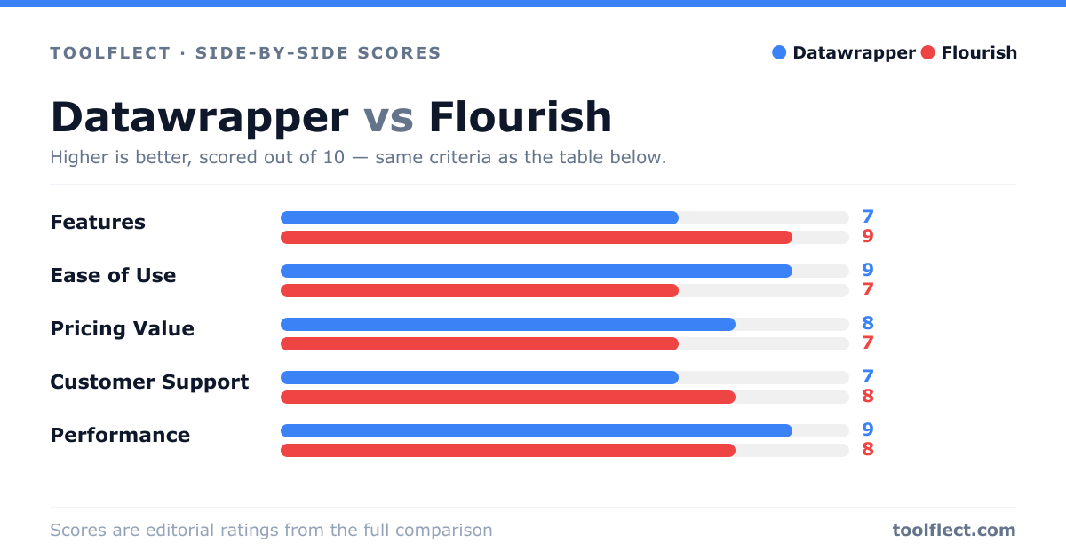
| Criterion | Datawrapper | Flourish |
|---|---|---|
| Features | 7/10 – Basic charts, limited interactivity | 9/10 – Extensive chart types, interactive and animated |
| Ease of Use | 9/10 – Very user-friendly, minimal learning curve | 7/10 – More complex, but manageable with tutorials |
| Pricing Value | 8/10 – Free tier generous, affordable paid plans | 7/10 – Free tier limited, paid plans higher cost |
| Customer Support | 7/10 – Email support, documentation | 8/10 – Knowledgeable support, active community |
| Performance | 9/10 – Fast loading, lightweight | 8/10 – Slightly heavier due to animations, but still good |